I have recently developed an interest in cartograms, and specifically the density-equalised type developed by Gastner-Newman. They seem an effective way to highlight areas with high values which can otherwise be masked at a small-scale in normal chloropleth maps.
I quickly produced a map based on some crime data available at the London Datastore. These are based on ‘violent crimes’ category, for all months in 2014, by lower super output area (LSOA) geography, and I expressed these as a crude rate per 1,000 population – this is the map on the left.
I then ran this plugin for ArcGIS in order to create the cartogram map on the right. This is based on the absolute number of violent crimes before I applied the same colour classification based on rate.
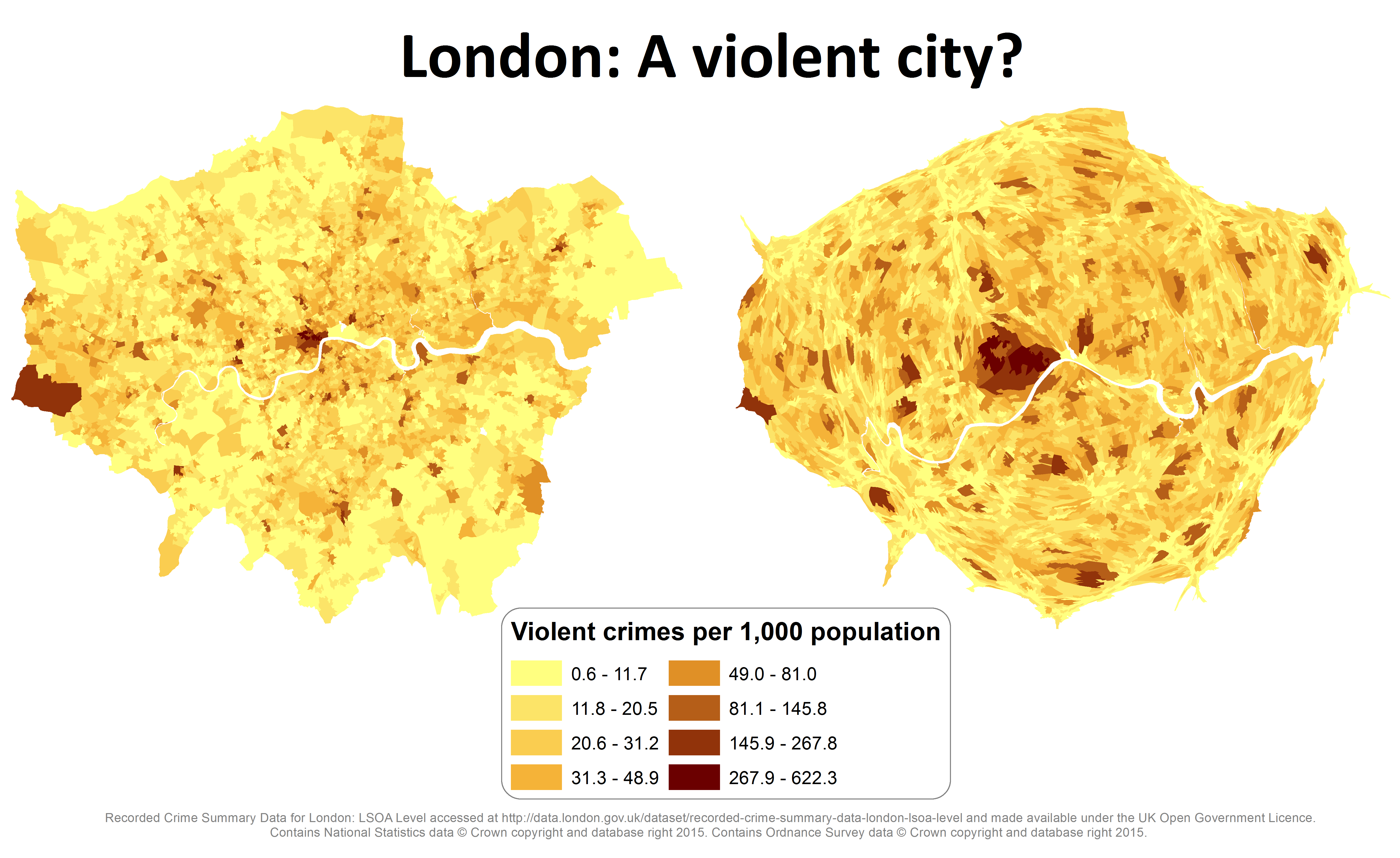
I think from a visual point of view it has the desired effect of highlighting areas with the higher number by increasing their size – in this case areas in Westminster and near Leicester Square. These areas can otherwise be masked at a small-scale, whilst large areas such as Heathrow airport out there in the west (which seemingly occupies the whole LSOA) can dominate our visual perspective.
I am quite new to cartograms so would appreciate any advice on their how appropriate they may be, and their best uses. As for the crime data itself? Well this makes London not so bad after all…unless you’re a tourist in Leicester Square…